Home & Living
Give a Purple Chair a Clear Material Relationship
Compare a purple chair with quiet surrounding materials, using texture, temperature and proportion to build a room relationship without collecting matching accessories.
This story may contain affiliate links. We may earn a commission on qualifying purchases. Read our disclosure.
IN THIS STORY
Let the chair establish one color
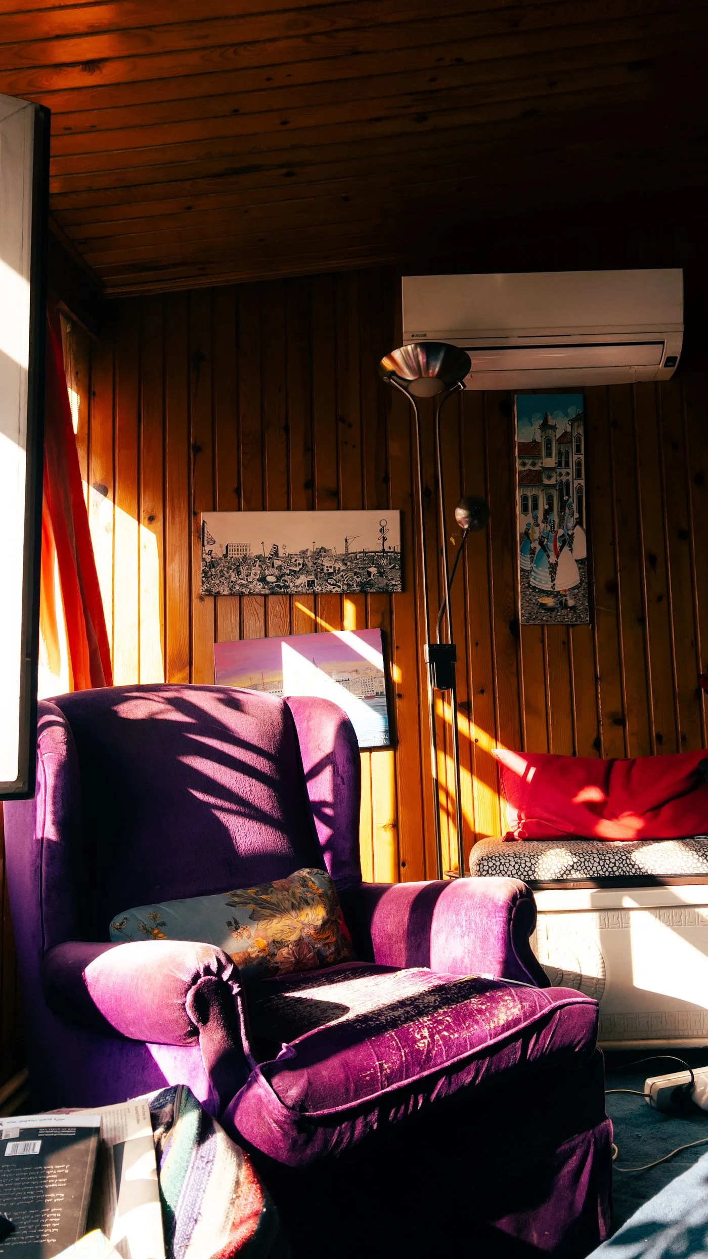
A purple chair can already provide the room's strongest color. Before adding a second purple object, look at the materials around it: painted wall, timber floor, metal table and nearby fabric. These surfaces determine whether the chair feels connected even when none matches its upholstery.
Choose a normal viewing position and name the largest retained surfaces. A pale wall and honey-colored floor create a different setting from cool gray tiles and white cabinetry. Keep these references in the comparison instead of treating the chair as an isolated color swatch.
Compare temperature before small details
Purple upholstery may look warmer beside reddish timber and cooler beside a blue-gray wall. Daylight and lamps can change that impression. Look during the day and again with the lighting you ordinarily use. You are checking your own room, not trying to find the one supposedly correct description of the color.
Place an existing neutral textile near the chair if it can be moved safely and without disrupting its normal role. Compare cream, gray or brown one at a time. A neutral that looks soft on its own can appear yellow, cold or muddy beside the upholstery. Reject the pairing if that relationship bothers you repeatedly.
Use texture as the connection
A smooth chair does not require every nearby surface to be smooth. A lightly textured rug or woven basket can provide contrast while sharing a quiet tone with the room. Conversely, a heavily textured chair may benefit from a simpler table surface beside it.
Look at the size of each texture from across the room. Fine weave can disappear at a distance, while a large pattern remains visually active. If the chair is already bold in both color and texture, adding another large pattern may make the corner feel crowded. Try a retained plain surface before shopping for a printed companion.
Keep proportion in the decision
A small side table can look delicate beside a substantial armchair, but it must still suit the intended use and available space. Judge its outline beside the actual arm and seat rather than choosing solely for a matching metal finish. Keep circulation and access clear, especially where the chair sits near a doorway.
If a combination nearly works, identify the specific disagreement. Is the table too visually heavy, the textile too glossy or the neutral unexpectedly warm? Change that variable first. Buying another purple cushion may repeat the color without addressing the real problem.
Stop when the chair has one or two clear material relationships with the retained room. It can share warmth with timber, contrast with a smooth surface or sit against a calm wall. An exact color match is only one possible connection, and often the room already supplies a more useful one.
Related reading
Compare an Accent Chair With the Lamp Beside It, Compare an Upholstery Swatch With the Room That Stays.
Girl In Home creates practical guides to style, home and travel. Our new buying guides explain selection criteria and tradeoffs; they do not claim hands-on testing. Our approach.