Home & Living
Compare Kitchen Timber Tones With the Painted Surfaces Beside Them
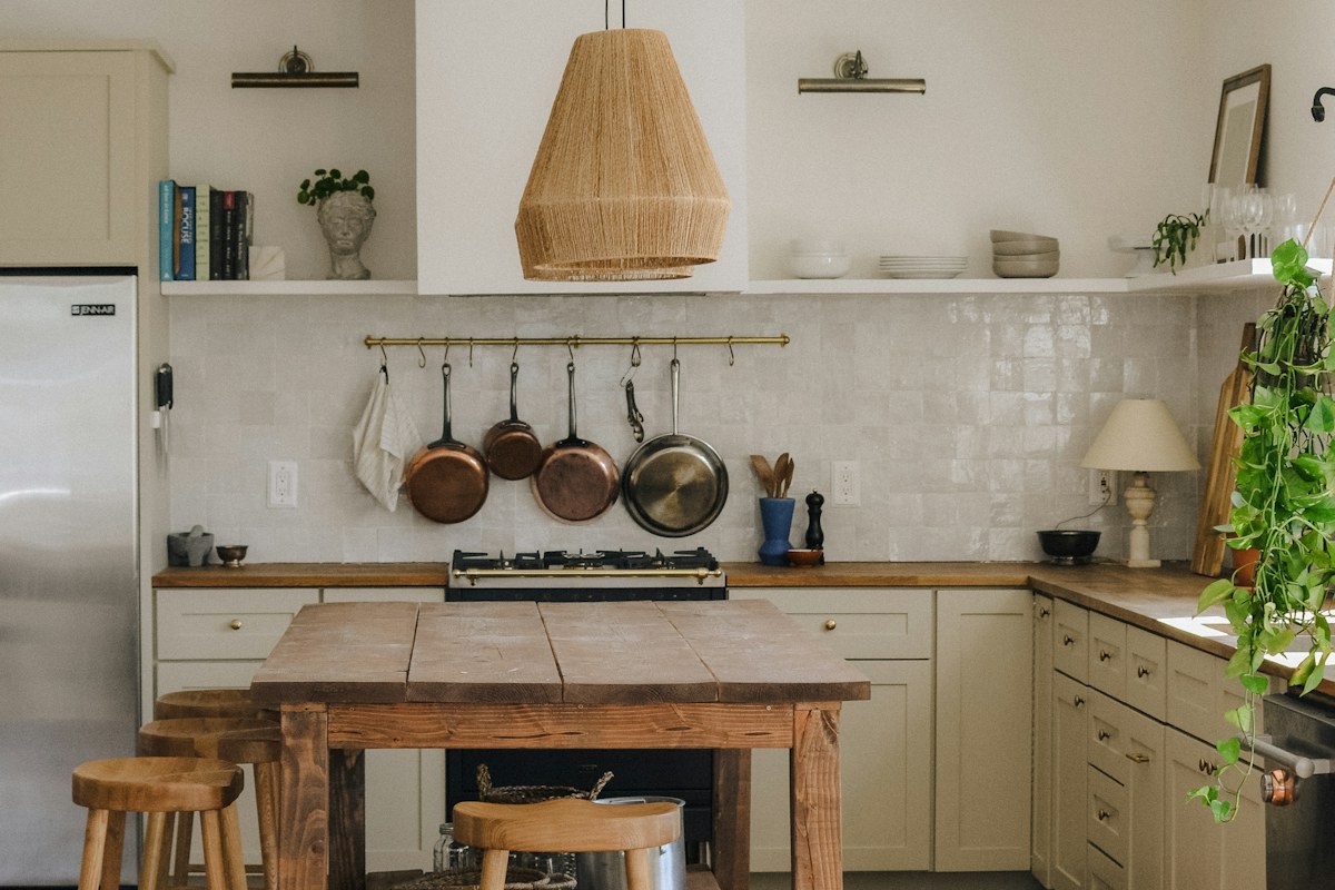
Compare timber-looking kitchen surfaces with the painted areas beside them, using retained references so a local color decision does not become a whole-room replacement plan.
This story may contain affiliate links. We may earn a commission on qualifying purchases. Read our disclosure.
IN THIS STORY
Identify the real neighboring surfaces
A timber-looking surface can read differently beside a painted cabinet from the same material beside a plain wall. Begin with the actual retained kitchen and name the specific neighbors being compared. A broad description such as natural kitchen may hide the local relationship that matters most.
Keep appearance separate from material identity. A warm grain-like image does not establish construction, suitability or care requirements. Product and practical project questions still need accurate information from their appropriate sources.
Decide which difference needs attention
Name whether the concern is tone, visible pattern or another actual feature. A new paint shade may leave a strong material pattern unchanged, while another surface detail can alter the view without replacing the painted group. A clear question keeps the comparison useful.
Keep the preference personal. Exact matching is optional, and a deliberate contrast can be as coherent as a quieter family of tones where it serves the actual room and person.
Use a suitable local sample
Choose an appropriate sample method through the actual product information and preserve its exact identity. Compare it beside the retained surfaces in relevant ordinary light. A note naming the sample and the real cabinet or worktop is more useful than saying the lighter one looked better.
A private photograph can preserve context but may alter subtle tones and reflection. Use the actual local view where those differences decide the preference rather than treating separate online images as an exact match.
Keep the complete kitchen group in view
Include the actual furniture, large cabinet area and other prominent retained pieces. A small sample can feel quiet alone while making a stronger relationship across the full group. Do not let one local color idea silently assume new textiles and accessories throughout the room.
If the setting feels unresolved, change one appropriate optional detail at a time. Replacing several surfaces together can conceal which difference actually helped and whether the whole new scheme was necessary.
Separate decorative choice from the work
Check preparation, compatibility and application through the relevant product guidance and appropriate expertise where required. An attractive color does not establish that a particular method suits the existing surface. Keep uncertainty explicit until the real question is answered.
What if the retained timber-like tones differ? Compare the genuine group rather than forcing every object into one assumed category. What if the current relationship already serves the room? Keep that useful result without inventing a purchase need. A considered painted-neighbor comparison connects local light and retained materials through one bounded decision.
Preserve the exact selected product reference if a change proceeds so another finish with a similar broad name is not assumed to reproduce the option actually checked.
Related reading
Build a Small Index for Household Kitchen Product Notes, A Calm Living Room on a Realistic Budget.
Girl In Home creates practical guides to style, home and travel. Our new buying guides explain selection criteria and tradeoffs; they do not claim hands-on testing. Our approach.